District
A neighbourhood café and bar, re-imagined online
Website redesign - prototype & handoff
Overview
Freelance website redesign for District, a neighbourhood café and bar with multiple London locations. The project focused on clarifying content structure, improving navigation across locations and events, and creating a flexible foundation for ongoing marketing updates.
Role
Product & visual design
Direct collaboration with the CEO and marketing team
Outcome
High-fidelity prototype built in WIX and handed over for internal implementation. The finalised structure, layouts, and interaction patterns provided a clear framework for ongoing content and campaign updates.
District:
Where Specialty Coffee Meets Community
THE CLIENT


Redesigning District: A Blend of Functionality and Personality
THE BRIEF
The Goals
-

Improve the customer journey
Streamline navigation and layout to make it intuitive for users to explore locations, events, and the online store.
Highlight key calls to action, such as newsletter sign-ups, ticket sales for events, and online shopping.
-

Communicate the brand identity
Implement District’s refreshed brand identity through updated visuals, colors, and fonts.
Showcase the brand’s unique selling points: specialty coffee, people, and community events.
Cater to the local demographic by emphasizing community and neighborhood values. -

Enhance communication & engagement
Create clear, engaging content that answers "Who we are?" and "What we do?" effectively.
Develop a platform that remains easy to update and keeps customers informed about events, promotions, and offerings.
-

Optimise for growth and conversions
Implement an SEO strategy to drive traffic from tourists, new area residents, and local businesses.
Focus on features like e-commerce, loyalty programs, and event ticket sales to increase revenue.
Customer Archetypes
In researching the audience for this project, I identified key customer archetypes across the four locations. Each store has a distinct demographic influenced by its surroundings, from affluent locals to busy commuters. While the website must serve a diverse user base, understanding these archetypes ensures the design reflects the unique needs and preferences of these groups. Below is an overview of the primary customer categories for each location, highlighting the distinct traits that shape their interaction with the brand.
Embassy Gardens
This group includes "yummy mummies," fitness enthusiasts, dog walkers, and influencers. They value high-quality offerings in a stylish, welcoming atmosphere. Many use the space for working remotely, favouring locations with ample seating and reliable
Wi-Fi.


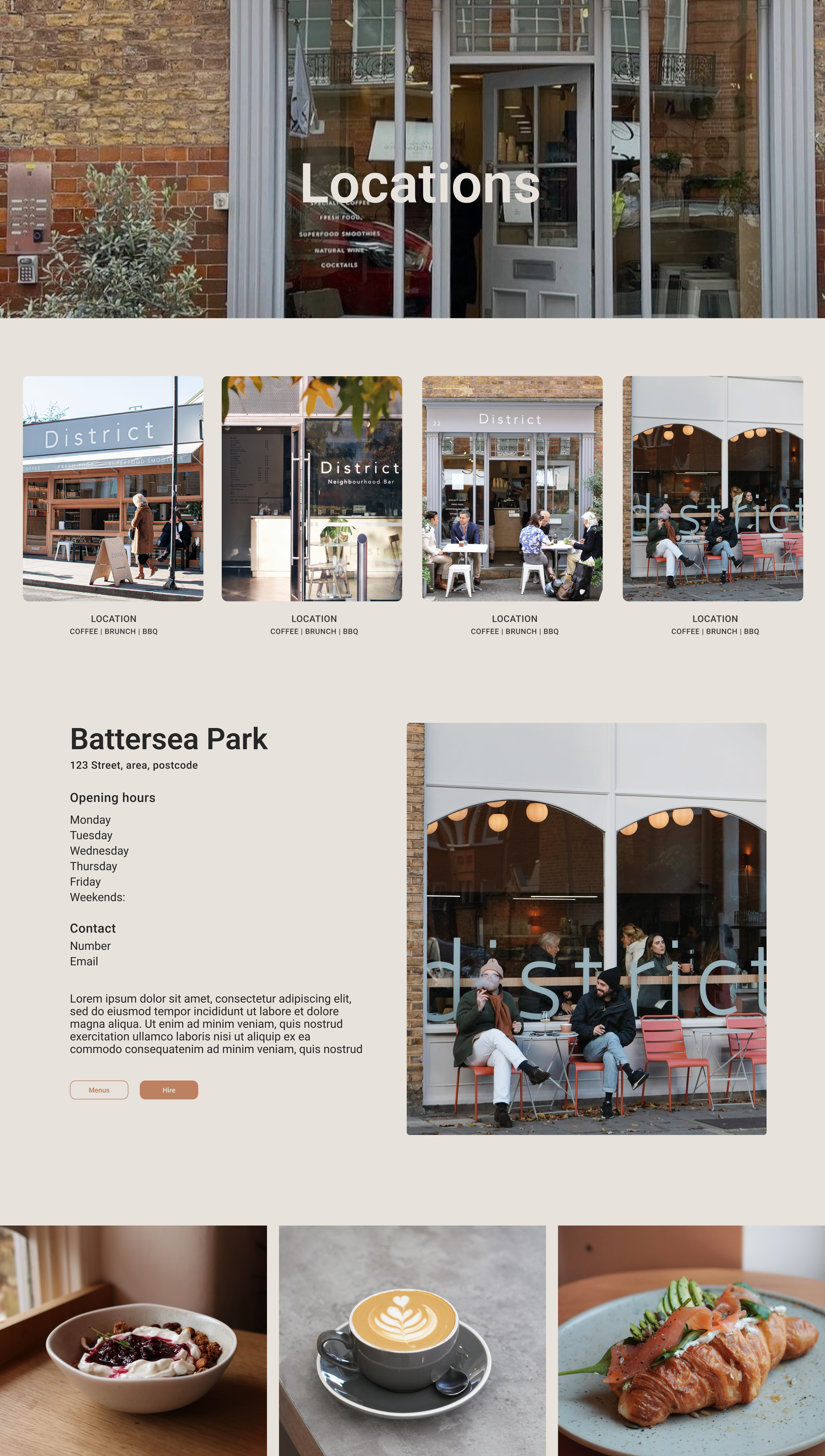
Battersea Park
Close to the park, Battersea attracts family groups, runners, and locals. This audience values a sense of community and convenience. Runners seek healthy, quick options and spaces to recharge after exercise. The website should reflect this balance of community and functionality.


Mayfair
Located near offices, this store sees a high volume of professionals during lunch breaks. Speed, quality, and efficiency are their priorities, as they often have limited time. Some visitors include high-profile individuals, so maintaining a polished brand image is essential.


Parsons Green
Positioned near the tube station, Parsons Green caters to busy commuters and locals needing quick service. This audience values convenience above all, with a focus on grab-and-go options and minimal waiting times. The smallest of the locations, this store thrives on regulars who depend on fast, consistent service.


The website
DISCOVERY
Competitors

Competitor Analysis
COLLABORATION
Exploring the Client’s Vision for District’s Website
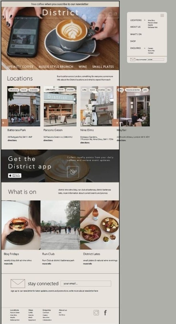
During my initial meeting with the Head of Marketing, I was introduced to this high-fidelity mockup of the homepage, which served as the foundation for our discussions on refining the design. Together, we identified core priorities and opportunities for improvement to better align with District's goals.
Key Objectives:
Highlight the unique offerings and identities of each location.
Promote upcoming events to foster community engagement.
Encourage app downloads and grow the newsletter subscriber base.
Create a homepage that reflects District’s vibrant personality and core values

Website mapping
PLANNING
This website map outlines the proposed structure for District’s redesigned website, aimed at enhancing user experience and aligning with the client’s priorities. This map emphasises accessibility and clear navigation while prioritising revenue streams like venue hire and events. It also accommodates user needs with dedicated sections for brand storytelling and practical information.
THE MISSION
Reflect the brand, simplify navigation, &
elevate key revenue streams, all while staying true to District's core values &community focus

DESIGNING
Early wireframes

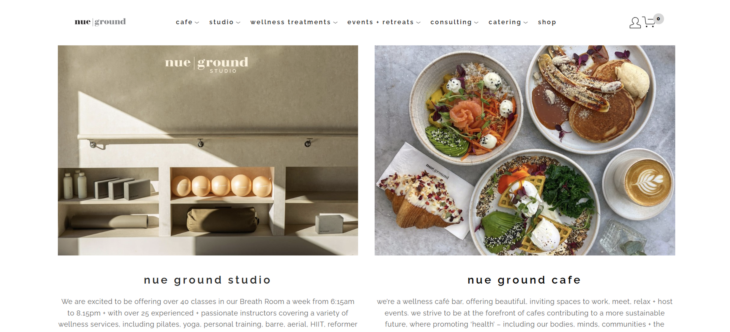
Reimagining a neighbourhood café experience.
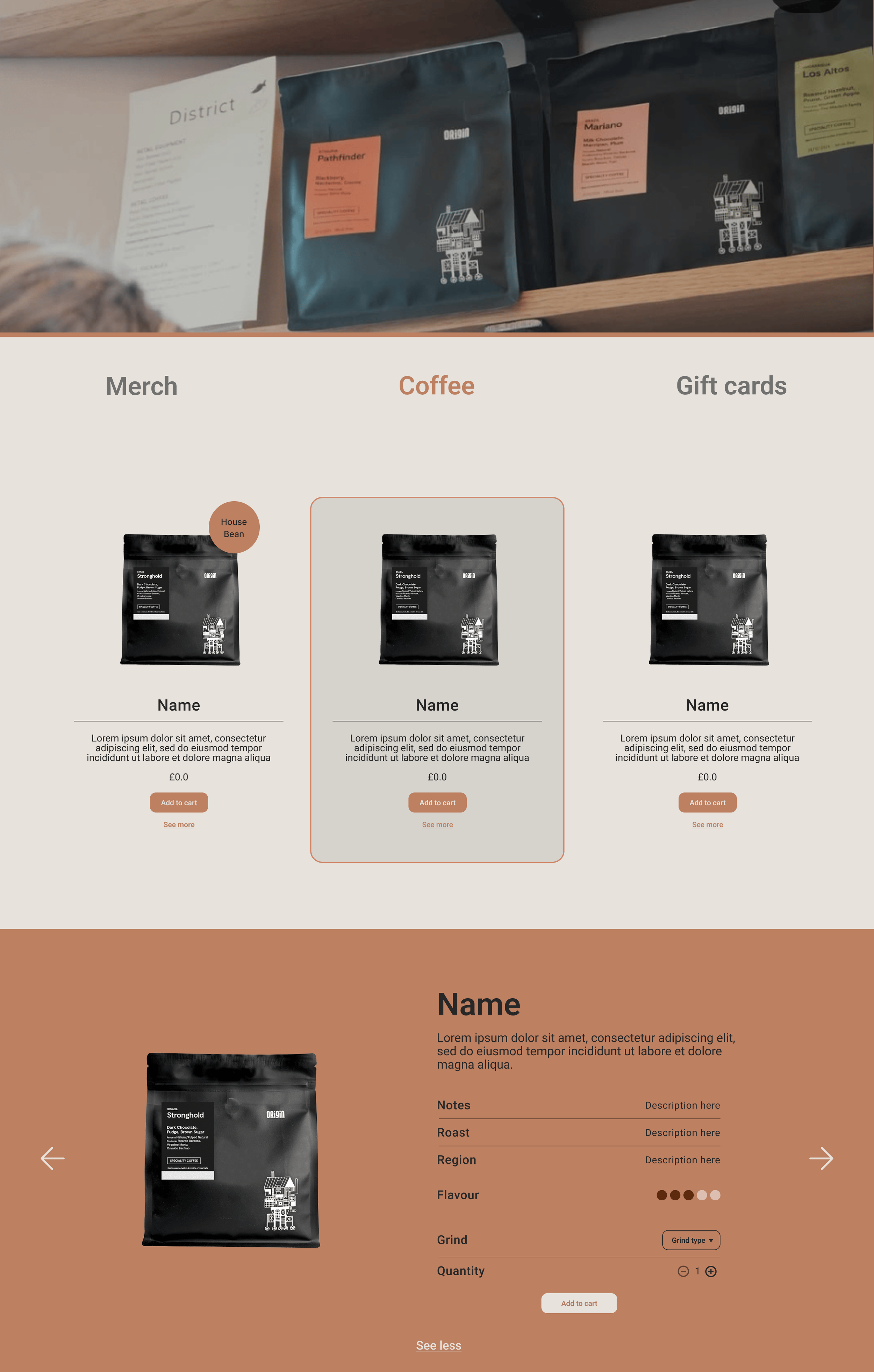
PROTOTYPE & HANDOFF

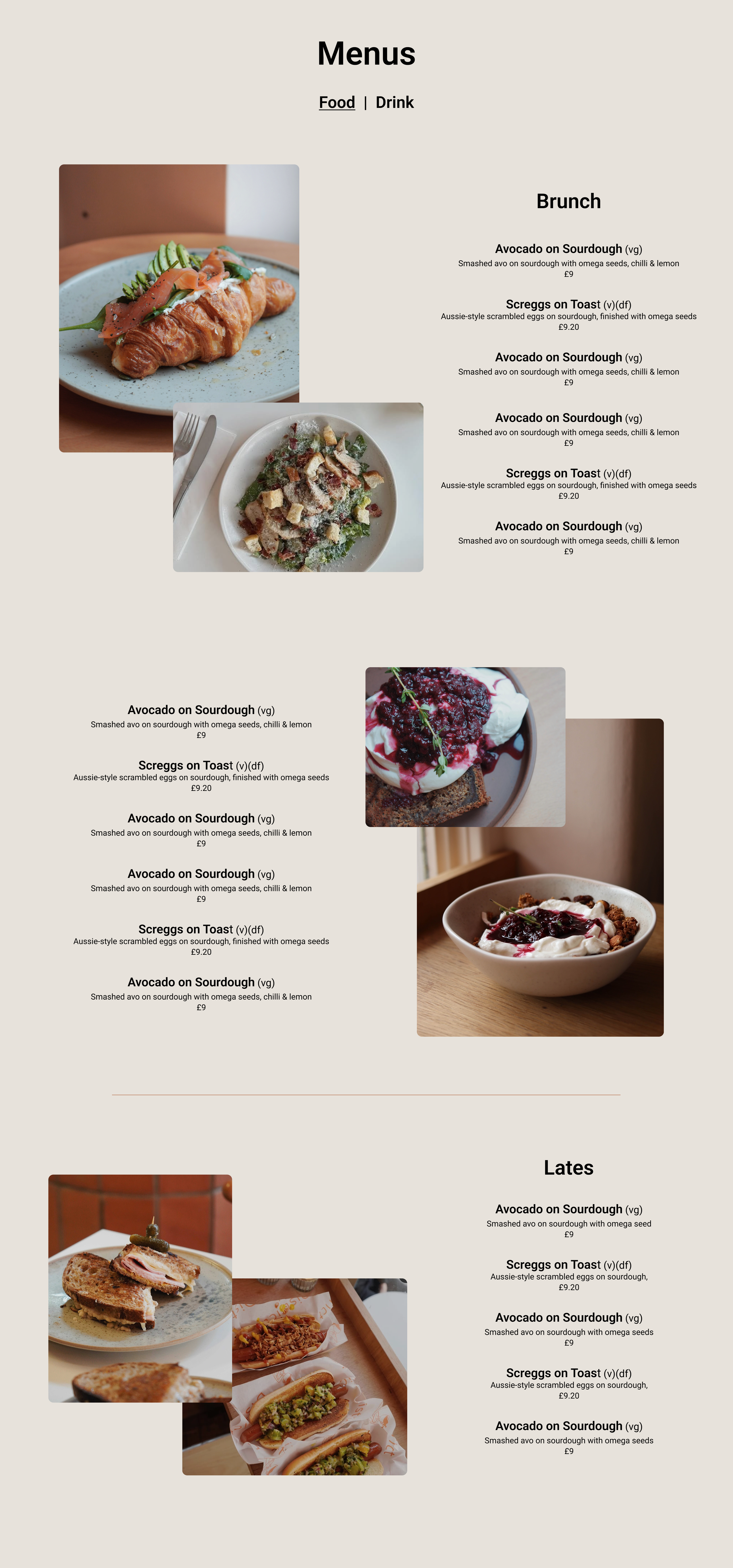
Events & Shop
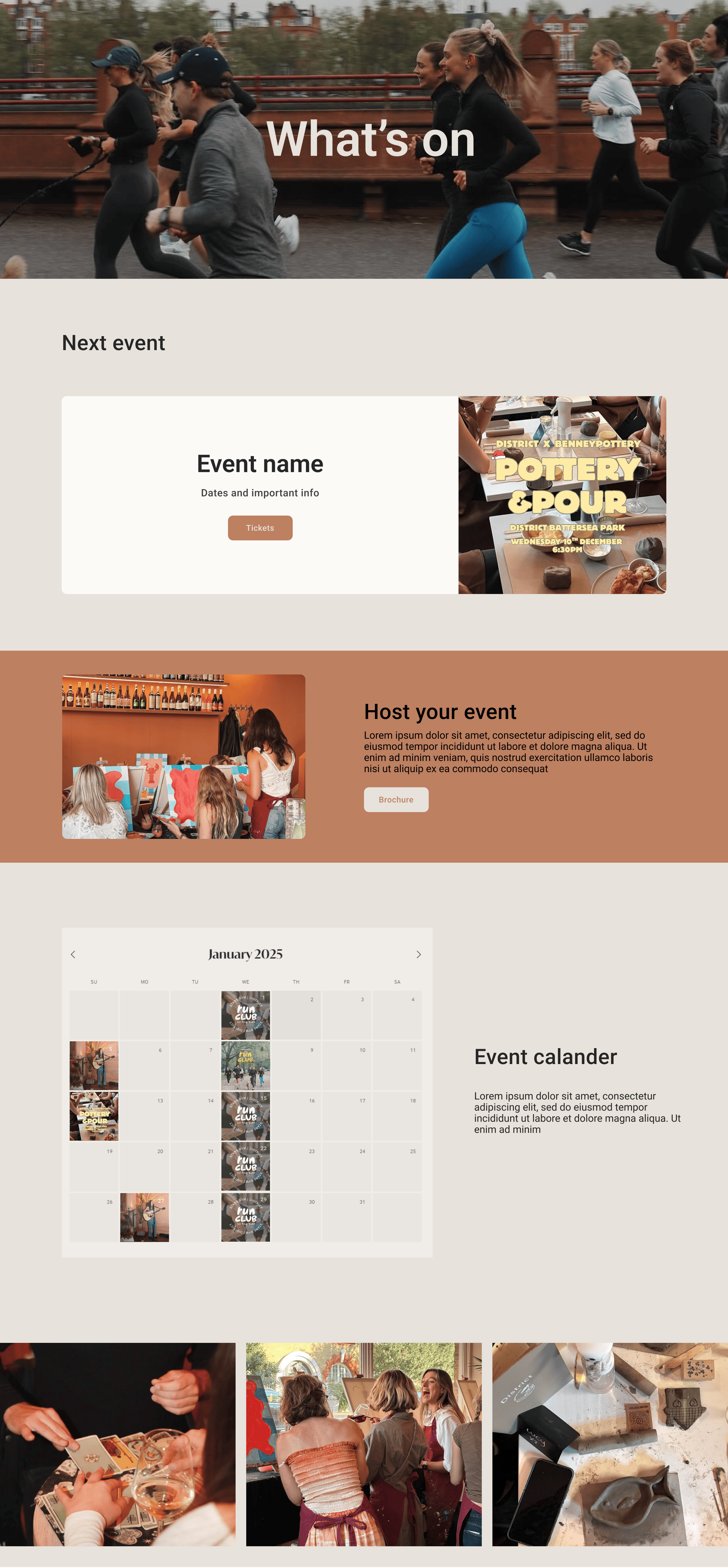
Locations & Menus